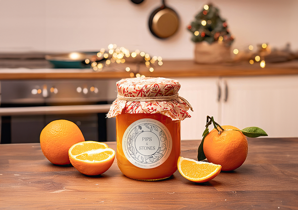
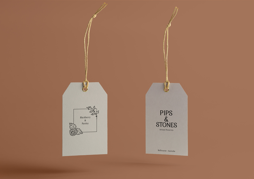
Pips & Stones is a Melbourne-based business dedicated to crafting homemade and artisanal preserves.
The objective:
The client asked for a logo with a homemade, rustic feel. They wanted it to feature fruits they use in their preserves and flowers native to Australia.
The solution:
I designed this logo based on vintage ink stamp logos to match the desired aesthetic. I also made illustrations to showcase the various flavours of the preserves.
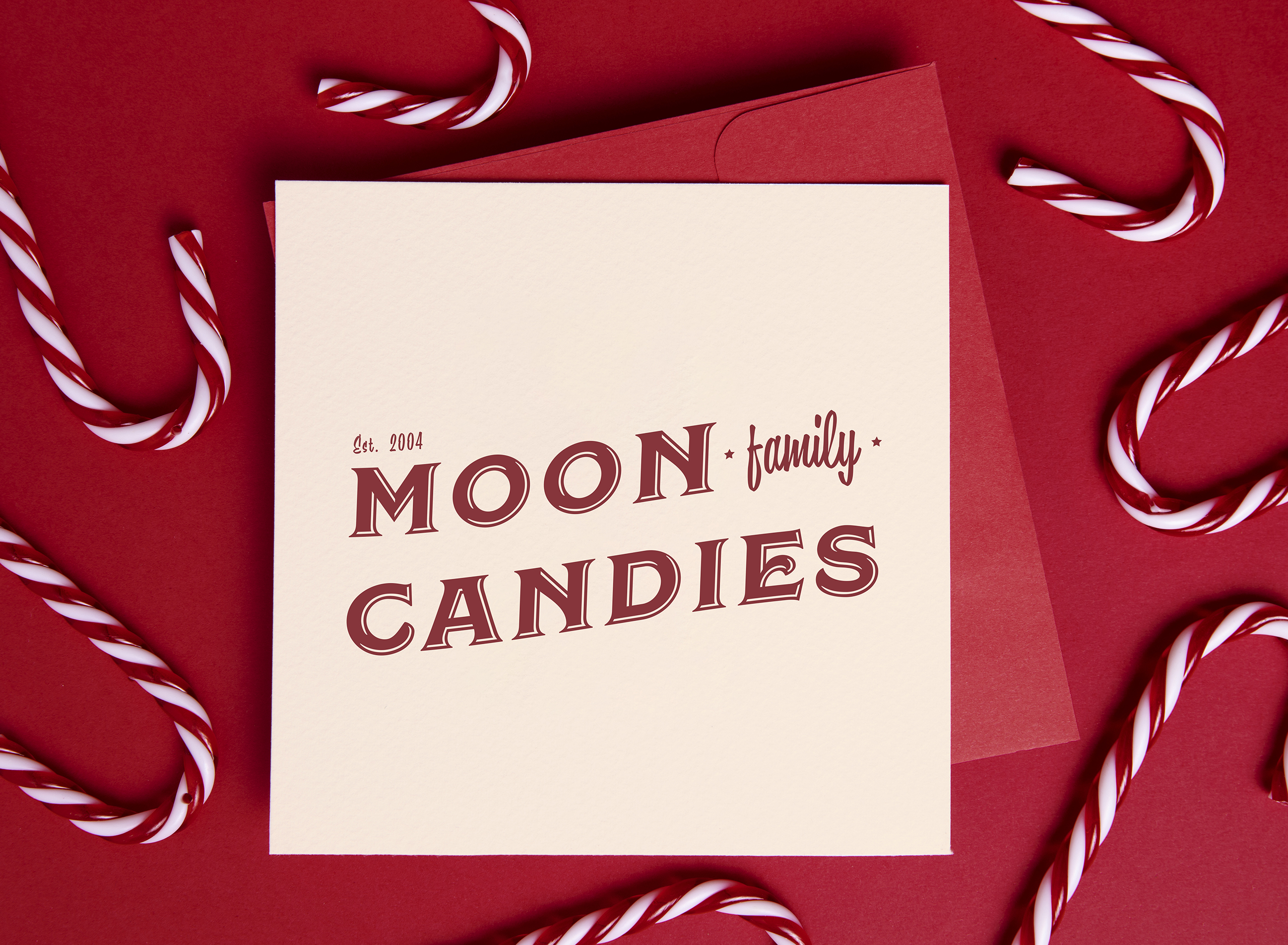
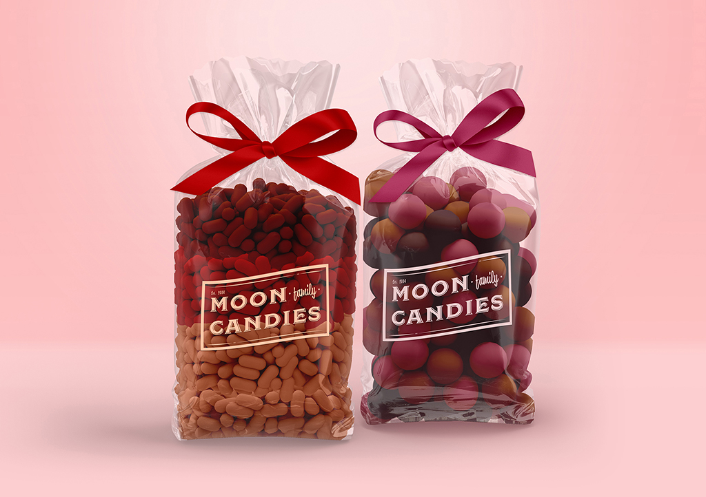
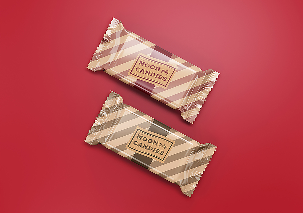
Moon Family Candies is a boutique candy company offering artisanal made-to-order candies. They offer a variety of flavours, including caramel, vanilla and fruity butter-creams.
The objective:
The client asked for a logo that evoked the nostalgia of old-fashioned candy stores.
The solution:
I created two versions of the logo using earthy colours that reflect the ingredients present in the candies. The client requested an old-fashioned look which I incorporated into the design.
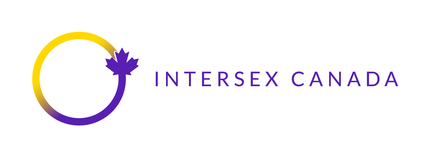
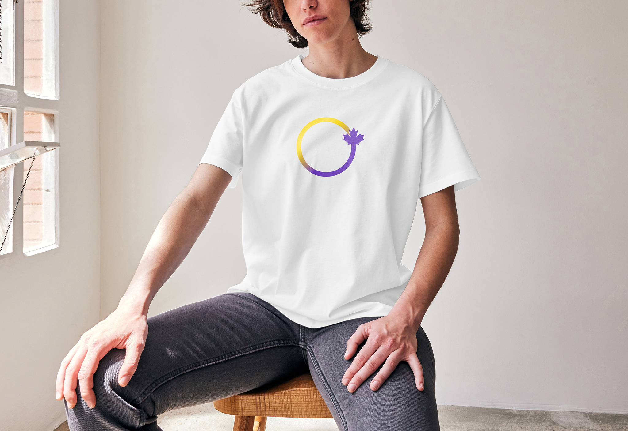
Intersex Canada is a non-profit organization that supports the rights of intersex individuals and their families through advocacy.
The objective:
The objective was to create a straightforward and uncluttered logo.
The solution:
I opted for the circle featured on the intersex flag. It’s described as unbroken and represents wholeness and completeness. The yellow and purple colours mean to be free from gender associations and represent intersex people.
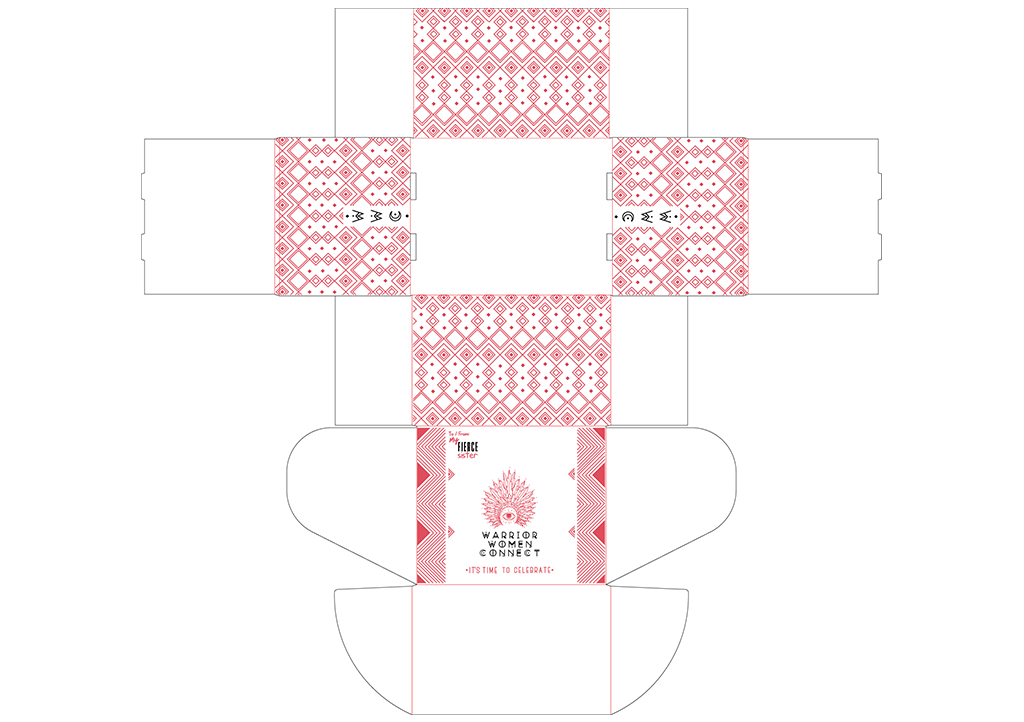
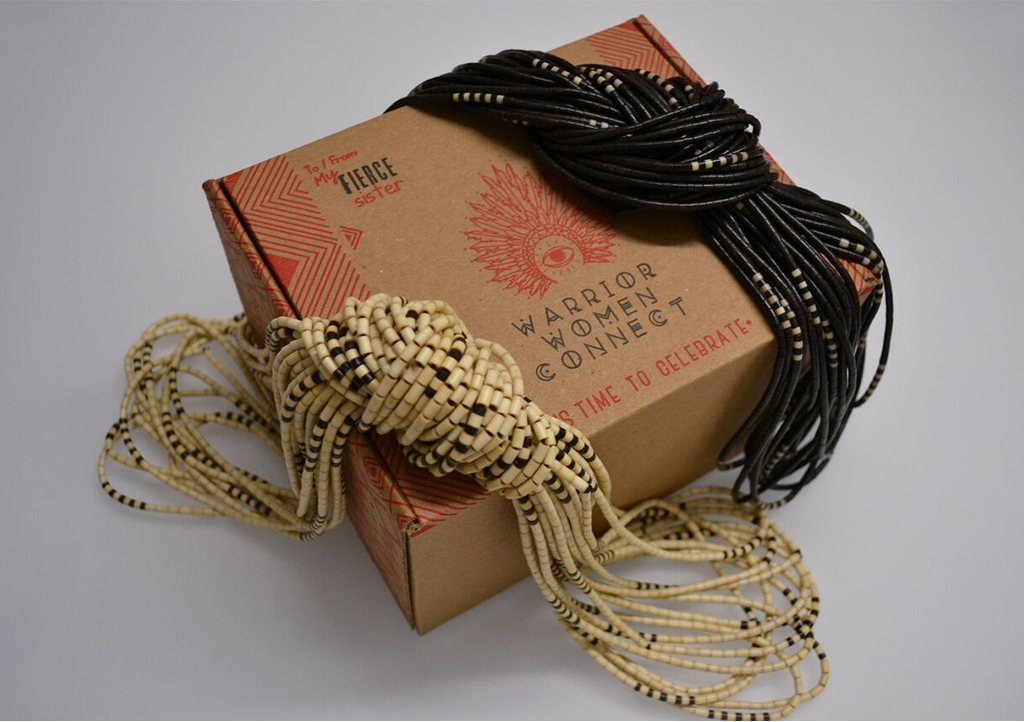
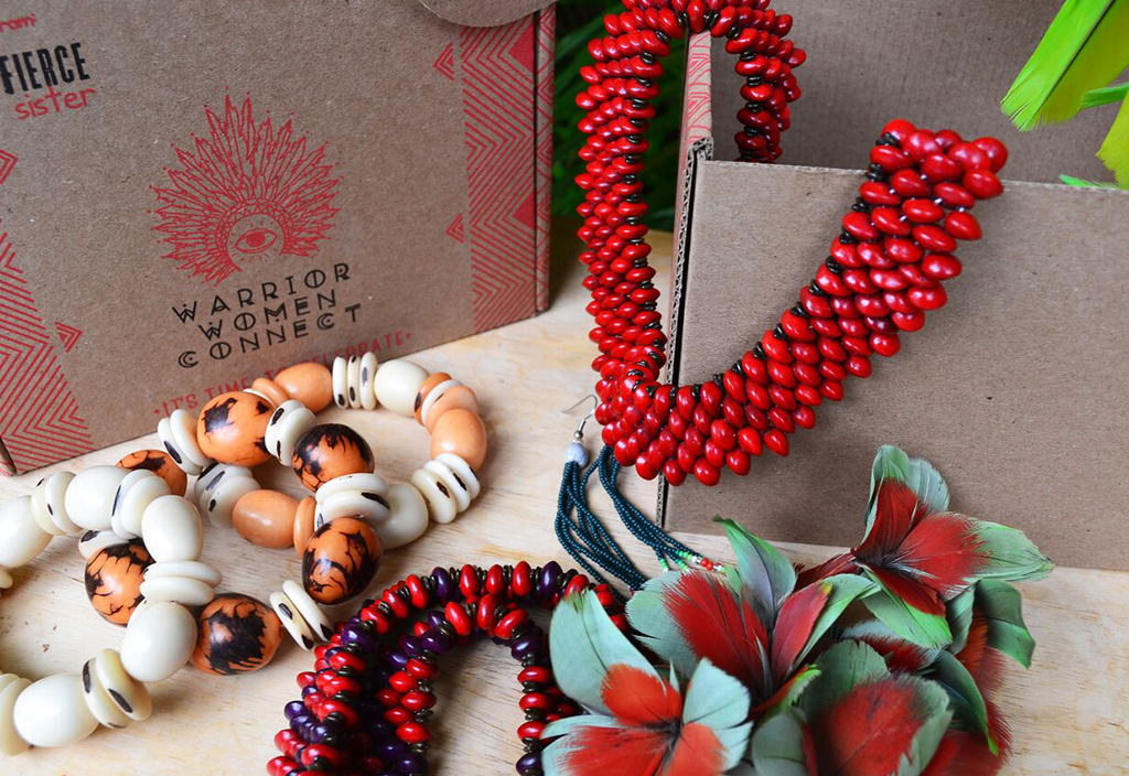
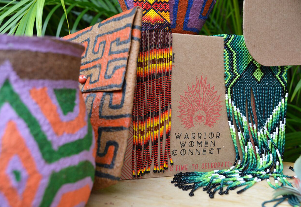
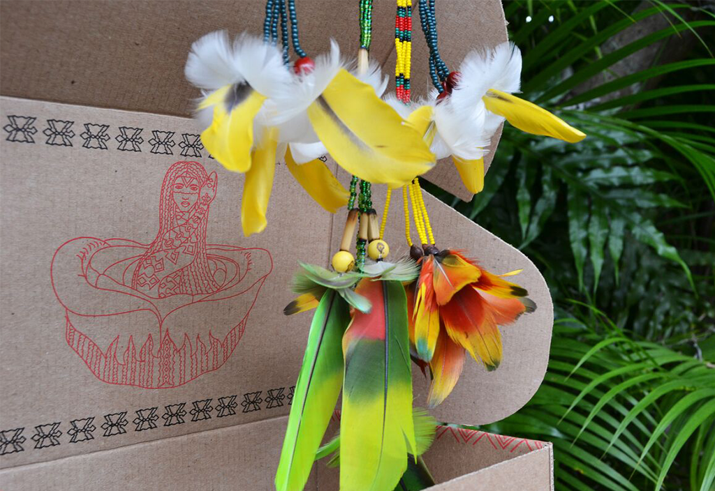
The Warrior Women Connect initiative is a membership program to fund visionary women. Members receive a series of artisan crafts made by the program’s benefactors.
The objective:
We aimed to design and produce a box specifically for the artisan crafts.
The solution:
I designed a cardboard packaging featuring the WWC logo and patterns inspired by Yawanawá Art. The inner flap of the box features an illustration called Uá Shahu, which an artist from the Yawanawá tribe created. With the artist’s approval, I transformed it into vectors for use on the packaging.